
In addition to the usual depiction of price charts in forms such as line charts or bar charts, many traders use a slightly more advanced and informative graph, called a candlestick chart or simply a candle chart. The chart is named after the individual columns, which resemble candles, and are therefore called candles. A regular line chart shows only the closing price, whereas a candlestick chart shows an opening price, the lowest price, the highest price, and the closing price for the selected time period.
Thus, the candlestick chart contains much more information than a simple line chart and provides a more visually nuanced picture of how prices develop within individual time periods. It may take some time to get used to candlestick charts, but once you do, you have a much better understanding of how the price has actually moved. In the following, we will deal with common candlestick charts, but there are also rarer types of charts, such as Heikin-Ashi or Renko charts.
Each candle typically consists of a thick bar and two thin vertical lines, which show the price range – that is, the range of movement of the price within a specific time interval, in the chart above, within a 10-minute interval. The thick bar in the candle (referred to as the body – sometimes the thin line is entirely contained within the body), is typically depicted in the colors green and red (also often shown as white and black). This bar illustrates the difference between the opening and closing prices. If the bar is green, then the closing price was higher than the opening price, and the market is in an upward direction. If the bar is red, then the closing price was lower than the opening price, and the market is in a downward direction.
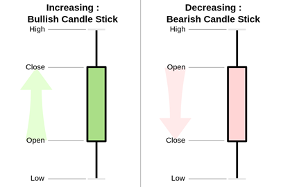
In the image above, two examples of what candlestick bars can look like are shown. To the left, there is a green bar, which signals that the closing price (Close) was higher than the opening price (Open) in the given period. To the right, there is a red bar, which signals that the closing price was lower than the opening price. The two tails (also called shadows) in the upward and downward directions mean that during this period – for example, 10 minutes on a 10-minute chart – the price has been both higher and lower than the opening and closing prices. Together, they represent the price range that the candle has moved within. The colored part, which surrounds the opening and closing prices, is referred to as the body
A green candle is called a bullish candle, because the price is moving upwards, while a red candle is called a bearish candle, because the price is moving downwards. The longer the body of a candle, the more the price has moved during the period. Therefore, the length of the body indicates the intensity of the buying or selling pressure within a time period. If the body is short, on the other hand, it indicates a small price movement, i.e., that the market has consolidated or is indecisive.
Both day traders and more long-term traders use a variety of candlestick types and formations to interpret the development of the price.
If, for example, you observe that the chart shows one or more long, red candles, it indicates that the market is rapidly moving downwards, and it can be very risky to buy before the market has consolidated a bit and indicated that it might be ready for a reversal. This situation is likened to trying to catch a falling knife, which is a strong warning. It can be very dangerous to attempt to buy in a market that is moving downwards rapidly. In this case, it is better – or at least safer – to wait until it perhaps stops, for instance, when a so-called doji appears, see below for more details. But it is not certain that this will actually be the case.
Special Candlesticks
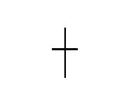
“An example of a particular candlestick type is a doji candle, which is a candle that has tails at both ends but a very small – or no – body, because the price opened and closed at the same level. It most closely resembles a cross. An example of a doji can be seen below. Traders view a doji as a sign that the market may be facing a reversal, or as a sign of indecision.
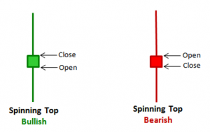
Another example is the so-called Spinning Top candlestick, which has a small body with long shadows in both directions, see below. This type of candlesticks, similar to dojis, signals indecision in the market.
Reversal Patterns
Just as many technical traders look for potential reversals and rebounds in the market by spotting double tops and bottoms, head and shoulders, or other patterns on the price chart, candlestick formations can be used for the same purpose. Observing a reversal pattern does not always mean that the current upward or downward trend will reverse, but rather that it is more likely to pause. Often, the market will then move sideways instead. Reversal patterns for candlestick charts should – to be effective – be viewed in context with previous formations. Two identical candlesticks can have different meanings, depending on the preceding trends and formations on the chart.
Most day traders do not use the shape of candles or formations of multiple candles as a standalone signal, but rather as an indication that can help support an assessment of where the market is heading. For example, one could imagine combining the reading of candles with other elements of technical analysis, such as MACD or Bollinger Bands.
There are countless forms of candlesticks and candlestick formations with exotic names like Hammer, Evening Star, etc. Some candlesticks even have Japanese names such as Harami, as candlesticks are originally a Japanese invention, which was used several hundred years ago to predict price movements in rice. Since then, Steve Nison, for example in the book “Japanese Candlestick Charting Techniques,” has introduced the concept for use in modern technical analysis of the securities markets.
Moreover, one can find more inspiration at, for example, Thomas Bulkowski’s excellent site, The Pattern Site, and Stephen Bigalow’s many interesting videos on YouTube of both shorter and longer duration. Many of them are definitely worth spending time on – for example, this video.